máo
my blogproject 4_process
I had some problems with the images on the final model, but I wasn’t sure if it’s a technical issue or maybe it’s just the problem with the fabric I used on the final model. The images looked fine in Photoshop, but once I ‘place’ them in InDesign, they got blurred and pixelated. So, I had to do a few test prints…

I printed out in grayscale first, but it looked awful, especially the one on the bottom left.

and, I did a color print, and it looked better but still pixelated in some areas…

then, I did my final print, and I am very happy with it as it looks pretty good on the actual print out and problems are barely noticeable…
project 4_12 page publication
here is my publication, it’s a process book on a laptop backpack i did for another class. Doing the master page was not as difficult as I imagined, but organizing the content was a real headache for me. I had a hard time deciding which layout order is the most logical for people… but here it is…
Pdf: Laptop Backpack Process Book
(the file is a bit big, so it might need some time to load…)
project 3_poster process
I always have lots of problems with chewing gums not being disposed properly. I hate it when I have to pay attention to the ground as I walk to make sure that I am not stepping on somebody else’s chewed gum. So, I guess this would be a good issue for me to do my poster and logo for the third project.
then I came up with this poster
I imagined the worry of stepping on a chewed gum is kinda like fetters that restricts us from walking carelessly. Then I included the quote (slogan) I got from Extra’s ad which is kind of sarcastic. But I realized that the background is too disturbing and makes the text hard to read, and also it’s based on real images rather than lines, shapes and colors.
Then, I applied the concept of my previous poster and came up with another version
project 3_poster in real location
The photos are taken at a bus stop in front of Burnaby City Hall
project 3_logo
This is the logo I came up with for the issue I am working on, does anyone know what this is about? ^^
process continue…
I didn’t quiet like the series I did previously, so I started searching for other source images on Google. Then, I found this website that has many photos of the International Monkey King Troupe.
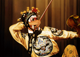
I then pick this image of the monkey king as my source image.

I opened up this source image as my background layer with Photoshop, and I duplicated it. Then I used cut and rotate to move his arm to the position I want, and I cloned the background where the hand used to be. Also, I replaced the hand and the bow using mask on another layer which gives me this…
Then I used Hue/Saturation and variations in the adjustments menu to try to match the tone of the hand with the rest of the image, and I also added on the violin. After I a few adjustments with the color, I ended up with 2 final versions…
With this version the lighting on the violin is too little which seems to disappear in the background
This one looks fine when it is small like this, but on the actual print, the lighting on the violin is too bright and the white on the bow seems to dim.
I find the most difficult part in the whole process of this project is to search for images that matches with the angle of my other images. My computer got virus attacks while I was looking for images online, sign…have to re-install my Windows again.
process
At first, I didn’t quiet get what Suzi meant by “series” on the handout, so I chose one source image and worked on three variations of it.
Below are the three variations I came up with:
But I didn’t like this landscape series I came up with, so I decided to work on another series which I will post later.
project 1 working process ~ test 1
I started off from this image of a rose

I was experimenting with different kinds of effects in the Filter menu, and I found that ‘Solarize’ seems to add a silky texture to the rose
So, I did a few tryouts with rose and different kinds of fabric texture


